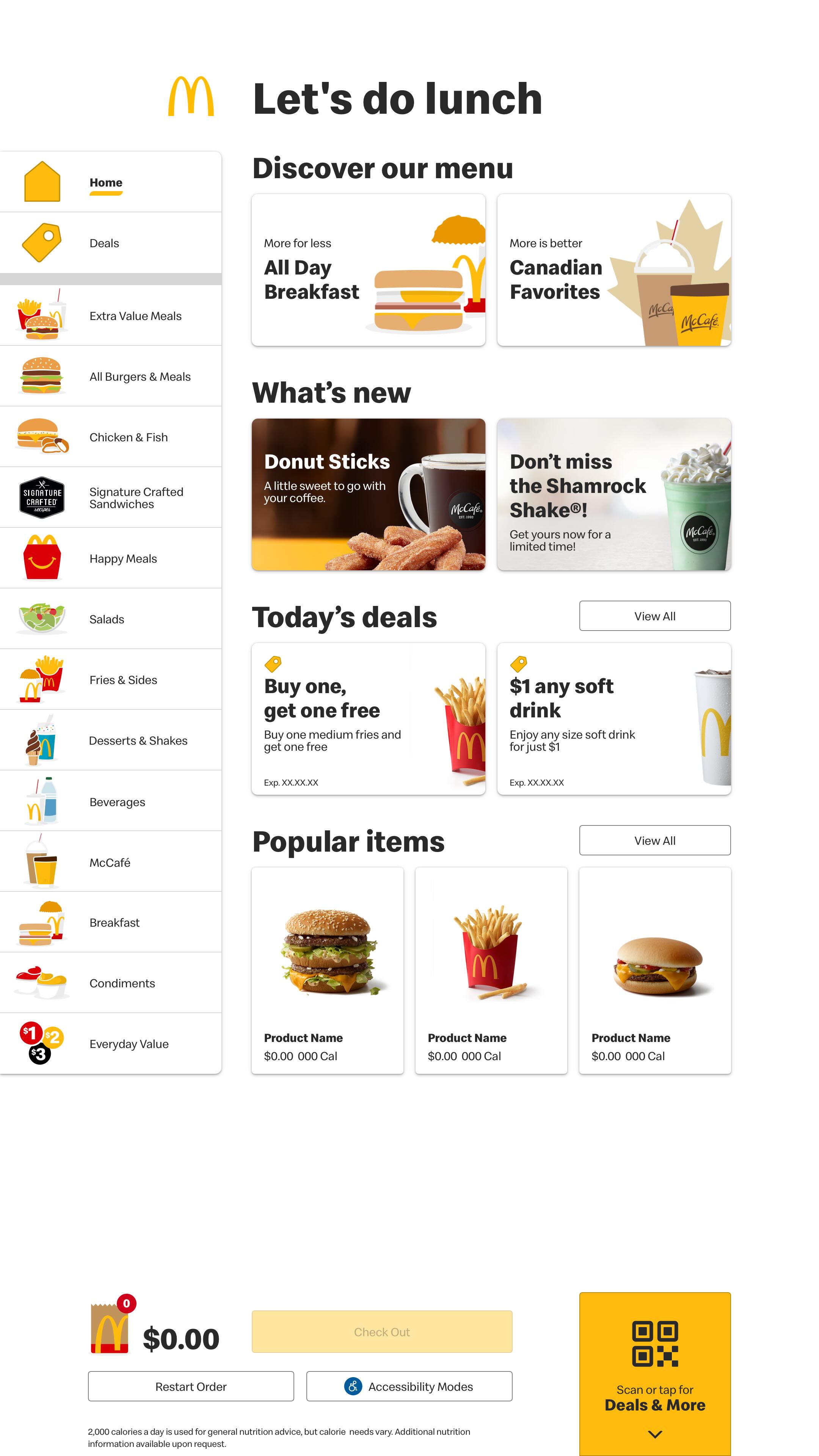
McDonald's Kiosk
Partnered with an agency to enhance McDonald's kiosk experience, focusing on improving upsell and cross-sell opportunities through smarter UX and design.
Role:
UX & UI Designer
Duration:
3 Months
Project Goal:
Enhance kiosk UX with upsell and cross-sell opportunities
Sample Deliverables
Explore detailed documentation and deliverables from this project.
Research & User Testing Results
Key insights from user research and testing sessions.
Pattern Recognition & Efficiency
Even non-Kiosk users were able to progress through the flow easily due to patterns they recognized and understood (e.g., yellow primary CTAs). The Kiosk seemed to be all about efficiency, avoiding a line, and getting food faster.
Upsell/Cross-sell Tolerance
Most don't mind the up/cross sell, though pop ups are a little more annoying than options that you can ignore.
Usability Clarity
From a usability perspective, all of the options for up and cross sell were understood, both from the perspective of not getting items offered and getting items.
Selection & Confirmation Preferences
The selection step was clear, and it was preferred to not have to go through a confirmation step (a la preference for the cross/and up sell that you can just ignore, but it was overall fine. Users like updates to the pictures to reflect new options.
Efficiency Concerns
For a few users, there was a desire to move to a Quick Add PDP or quickly add the item to your bag rather than having to go through more steps. Using the kiosk is all about efficiency and some of the cross and upsells seemed to not be super efficient.
Related Item Preferences
Users wanted the items suggested for U/C Sell to be related items. And if there were no related items to not show anything at all. They preferred the Burger/meal upsell over the coffee one because it was on the page and you didn't have to acknowledge it to move on. Felt less intrusive.
Customization & Personalization
Overall preference for customization, though a few didn't want to have to log in to the kiosk and would have preferred to just order on GMA. For a few, suggestions based on weather were not welcome (too invasive, crossing a line), though suggestions based on data/correlations that were more general seemed to be fine. Some people acknowledged that they were kinda weird and always went against the grain, to which customization would benefit them.
Standard Experience Expectations
A few said they wouldn't ever utilize the US or CS modules, but their presence wasn't bothersome. Most said that it's kind of standard these days in some sort of checkout or purchase experience, whether digital or physical, so it wasn't out of the ordinary. Most were agreeable.
Beverage Upsell Visibility Issues
Beverage upsell was not understood in the meal loop. Users could barely see the options and most didn't even notice the module at all. The text was too small to read. No feedback about the size. A few users thought its placement was awkward in between the other options and would have preferred it not to interrupt the beverage options. Most overlooked the 'Thirsty for more?' header and barely noticed the grey background. Test effects here possible, because they could not read the tiles.
Meal Upsell Confusion
A few confused the meal upsell to be customizations on that item rather than different products. Though it made sense that they were different products, the feedback was that it should be related items and not things crossing protein categories, for instance. May have been test effects as they could barely read.
Coffee Upsell Logic
The coffee upsell didn't always make sense to users - they preferred there to be some sort of logic - like if you were browsing, upsell could be an option, but if adding directly from product tile (on home screen), don't add suggestions.
Multiple Item Selection
On the cross sell drawer after coffee selection, most felt they should be able to select more than one item. If it didn't, they would know how to go select it on their own, but felt that it should allow them to do so.